The Curwen Press can be regarded as the high point of mid-twentieth century creative, commercial letterpress, and no one was better qualified to describe it than John Dreyfus – successor to Stanley Morison as typographic advisor to the Monotype Corporation, Assistant Printer to Cambridge University Press, a director of the Curwen Press from 1970 to 1982, and unofficial advisor to Matrix on all matters typographic from its second issue in 1982 until his death in 2002. The wealth of illustration that accompanied his article came from the unique Curwen archive at Cambridge University Library. David McKitterick’s fine tribute to John appeared in Matrix 23. John Randle

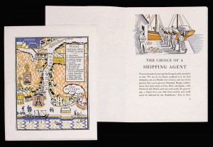
Line drawings from a set of ten made by Edward Ardizzone (1900-79) for the Curwen Press Newsletter no. 15 (May 1938).
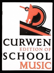
Scant interest in fine printing was shown by the reverend John Curwen when he founded the Curwen Press in 1863 to print music. His printing-house was created as an adjunct to his Tonic Sol-fa School set up in the same year. For he had realised that his method cleared the five-bar gate of clefs, crotchets, quavers, semi-quavers and demi-semi-quavers which had previously formed such a frightening obstacle to teaching congregations how they ought to sing religious music.
Only when his grandson Harold Curwen (1885-1949) took over control of the Press in 1916 did its output begin to acquire a thoroughly deserved reputation for the quality of its design. This was quickly enhanced by the talents of Oliver Simon (1895-19
56) who joined the Press as a trainee in 1920. Gradually the Curwen Press came to be associated with the printing of fine books, many of them brilliantly illustrated by the stencil process or by autolithography, whereas the Press had previously been active mainly in general commercial printing (and indeed never developed a capacity to print books on a large scale). How all this was accomplished has already been so well recorded that it seems preferable to give readers of Matrix some idea of the scope and variety of printed material, letters and records which have now been brought together through circumstances which David McKitterick explains on pp.15-22.
Most of the Curwen Press items now at Cambridge were collected together by Oliver Simon. A lively account of how he impressed his American devotee, Beatrice Warde, can be found in a large collection of her letters kept in the Stanley Morison Room, close to Oliver’s papers. Beatrice set down her impression in a letter to her parents sent on 25 February 1925 from 115 Ebury Street, London SW1, where Oliver occupied Max Beerbohm’s upstairs pied-à-terre. Immediately below, Beatrice and her husband Frederic were living in rooms they had taken soon after arriving from New York. Frederic had been invited to join the Double Crown Club, a typographic dining club described by Beatrice as:
a most exclusive organisation of wits and learned folk associated with publishing and the arts which it subsidises. It is an informal but terribly brilliant affair, and I am quite staggered at the membership list which contains about fifteen names all of the first water. Mr Oliver Simon is one of the leading spirits. Mr S. is an urban and urbane young man, the sort who knows who is who in Serena Blandish ‘and gets put in novels frequently’ and drifts about in the intellectual swim. His amazing galaxy of uncles gives him something to live up to, at that. His mundanity contrasts with and yet supports Morison’s somewhat temperamental idealism. they misunderstood each other well enough to be devoted friends and associated.
As a young man, Oliver was indisputably urbane and also in the intellectual swim; but the picture of him sketched by Beatrice Warde was plumped out by a remark in a letter written by the artist Barnett Freedman to Oliver’s wife, Ruth, who had sent Barnett a plant while he was undergoing lengthy treatment in a Stepney hospital during February 1928. He asked her: ‘How are you & your baby – Mr Simon I know is in a state about some artist or other – he used to amuse me whenever I went to the office, he was always in a stew about something or other – but then that’s the real enthusiast.’
With the works of the Curwen Press down at Plaistow, inconveniently far away in the East End of London for London publishers and advertising agencies, Oliver sensibly opened an office in the West End, first at St Stephen’s House in Westminster, and from the spring of 1924 at 101 Great Russell Street in Bloomsbury. His office also helped him to keep control over the many artists he commissioned, as we can read from a letter sent to him by Edward Bawden on Tuesday 23 October 1934:
I rang you on Monday but with no result so later on I rang up at the office and drew a blank. Mr Simon, I was told, had stopped at home. Oh! I exclaimed. – Yes, Mr Simon has a cold. Thereupon I hung up the receiver and experienced a distinct feeling of relief. I felt it would be an intrusion to ring up your private phone. I knew you would very likely be asleep & there would be an unnatural & stilly quiet at 40 Downshire Hill, & who was I to ruthlessly shatter this silence & to wake up dear Oliver from a cold-healing sleep simply to explain why the News-Letter design happened to be a day late. Would Oliver have been pleased to hear my excuses? No, of course not . . . So I reasoned. Hence the sense of relief: & further the fact that I did not attempt to phone or write again.
But the Curwen Press is efficient. They caught me this morning, as I stirred my mid-morning tea at Goldsmith [s College] & asked some very pertinent questions in what sounded to be a very militant voice. In the flurry of the moment I promised to send the design by first post Thursday morning & you may sleep assured that I shall do all I can to fulfil this promise.
I am sorry you may have been wakened. May Ruth quickly tuck you up again.
By 1934 Oliver had proved himself to be a capable editor, as well as a talented typographer. With Stanley Morison’s help and encouragement he had launched a typographical journal named The Fleuron in 1923. Its first four volumes were edited and designed by Oliver, and were printed under his supervision at the Curwen Press; the last three volumes by prior agreement were edited and designed by Morison, who had them printed at the Cambridge University Press where he served as typographical advisor. Oliver later showed his flair as an editor with two series of Signature, a quadrimestrial of typography and the graphic arts. It was printed to his own design at the Curwen Press. One letter about Signature which must have given him particular satisfaction was sent to him by Edward Gordon Craig, who wrote on 29 November 1938:
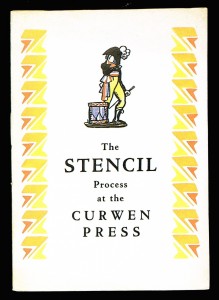
Cover incorporating a design by Claud Lovat Fraser for a twelve-page booklet describing The Stencil Process at the Curwen Press.
I very much like Signature. And if i did not sign and send in the first order form which reached me (for nos. 10 to 13) it was only that I could not send you the 10/-. And I cannot now. but i can prevent you supposing I am indifferent about the whole matter – in fact it is necessary I let you know I am far from indifferent to the excellent work & the pleasure it gives me to see it. As you know I once produced The Mask and found that indifference shown about it by anyone was the most killing thing of all.
As you might expect, many of the letters in the Curwen Press Collection contain fairly routine expressions of polite appreciation for work done at the Curwen Press; but the collection also includes some letters of great interest sent to Oliver as editor of The Fleuron. The most important in this category were written by the great American scholar-printer, D. B. Updike, founder and director of the Merrymount Press in Boston. He contributed to the three first volumes of The Fleuron and after reading his own piece in the copy of no. 2 sent to him by the editor, wrote a rather rueful note on 25 February 1924 admitting to Oliver: ‘I cannot say that I thought my article very good, on reading it, and it has taught me that I use too many italics.’ (This lesson reminds me of another master-printer who intends to call his autobiography The Italics are Mine).
Updike and Simon shared deeply-held views on a number of typographical matters. They corresponded about the practice of allusive or ‘period’ printing, and on this topic Updike wrote to him at great length on 9 September 1924. His central argument deserves to be quoted in full:
I am entirely at one with you in what you say about the practice of redrawing old ornaments for use in books printed in 1924, and as i have tried to point out in my paper, although the redrawing will always show traces of being a 1924 rendering, none the less, it is an unfortunate thing to do. I dare say there was a certain amount of copying in the past generations who made the ornaments which now seem to us original, but it was by no means the habit which it now seems to be. If you look, for instance, at some of Sir William Stirling Maxwell’s great folios, or some of the early attempts of Whittingham to imitate Troy,we feel that they are very tiresome and commonplace. Certainly, work like Rogers’ is infinitely better rendered than those, and it seems to us now quite full of the spirit of the originals. But none the less, there are little marks of our own age showing that they are reproductions, and these marks will become increasingly prominent as time goes on and we get farther from them. Particularly in this country, decorative art has become a discovery of wild delight to a great number of people, and even things that are commonplaces of decoration seem to those who don’t know their derivations, to be startlingly new. hand-books are appearing by which we shall soon be able to make fools of ourselves in any historic style. For good ornament (and good type, too) is by no means foolproof, and one can misuse both in such wretched fashion, that the effect is, to those who know, more stupid and unsatisfactory than the same arrangement made in type or ornament in less stylistic quality. Certain modern books seem to me impossible in these so-called historical types. And while I cannot suggest a remedy, I can certainly agree with you as to the abuse.
A partial remedy to this state of affairs has already been suggested in a Curwen Press calendar and diary issued in 1922. At that time Oliver was working closely with Harold Curwen (1885-1949), youngest nephew of the Press’s founder, and the man who had taken on Oliver as a pupil in 1920. Neither Harold nor Oliver put their names to the following statement which appeared in the 1922 calendar and diary, but they would both have been in complete agreement with its content:
We have some charming old English and French printers’ flowers in use at the Curwen Press. At the same time we are trying to produce flowers, ornaments, and initials of our own time, and we have a big selection, contributed by contemporary artists. We have, in fact, a collection widely chosen and continually receiving additions. Their employment adds zest to our work, and has already led to results which have been appreciated by a large number of our customers and friends. Surely each generation ought to leave its own characteristic IMPRINT.
A typographical pun may have been emphasised by setting the final word in capitals: The Imprint had been the name given to a short-lived typographical magazine published in 1913. It was printed in London at the Westminster Press, whose owner, Gerard Meynell, commissioned a new typeface (Monotype Imprint Series 101) which was named after the magazine in which the type was first used. The relationship between Meynell and Curwen had been one of mutual respect mixed with commercial rivalry. Curwen had studied typography under two of Meynell’s editorial colleagues on The Imprint, namely Edward Johnston and J. H. Mason. And like Johnston, Curwen drew a new sans serif type: his designs for it were finished in 1911, five years before Johnston completed his sans serif design for London Transport.
Curwen’s sans serif was cut as type only in 1928. His drawings for it are not among his original designs for typefaces at Cambridge, but the collection there does contain his drawings for the Curwen Press poster type designed in 1918-19.
Both the sans serif type and the poster type were unsuitable for book work of the kind in which Oliver Simon was particularly interested, and which he was encouraged to develop as a market for the Curwen Press. So in April 1929 Oliver commissioned a splendid set of decorative initials from the Dutch type designer and calligrapher, Jan van Krimpen. Originally they were intended for use in The Legion Book, a work which was published in autumn 1929 with valuable editorial help from Oliver, and which was printed at the Curwen Press to raise money for the British Legion. In the event the Van Krimpen initials were never used in that work, but they were used on many other occasions to great effect, as can be judged from the reproduction on plate 12 (Newsletter 3). The original drawings are also preserved at Cambridge.
Oliver’s interest in bookwork led him to acquire the Monotype cutting of Lutetia, a type originally designed by Van Krimpen for the Enschedé foundry in Haarlem. Reviewing the foundry version anonymously for The Fleuron vol. v in 1926, Morison described it as ‘a new type, underived from any historical predecessor or school’. But Oliver’s reasons for choosing new text types to install at Plaistow were not mainly doctrinaire: one of his favourites was an early nineteenth-century German type named Walbaum. In 1925 he acquired founts for hand composition from the Bertold foundry in Berlin, but later persuaded the Monotype Corporation to recut it for mechanical composition. He also acquired some finely-wrought decorative brass borders from the Bertold foundry.
To install new composition faces involved considerable expense; but for a relatively modest outlay Harold and Oliver were able to commission a wealth of new decorative borders, ornaments and pattern papers from contemporary artists, and in some cases the records in the Cambridge collection reveal exactly how much was paid.
The period 1926-41 is particularly well covered by a handwritten record kept in two ruled notebooks. This recorded artists’ names, the dates when they were commissioned, descriptions of what was ordered, and the dates when the work was completed; in addition the record showed amounts and dates of payment, and in many cases the dates when the file copies of the printed reproduction were sent to artists.
Artists enjoyed the opportunity to work for the Curwen Press, not only for fees paid but because of the care taken reproducing their work. This was particularly true of illustrations reproduced by the pochoir (stencil) process, set up by Harold Curwen in 1925 and continued until 1932. The process was exploited with great skill by E. McKnight Kauffer, but even he acknowledged how much his book illustrations reproduced by pochoir owed their quality to Harold Curwen’s skill in running a department for which he trained the staff so well. Kauffer expressed his gratitude to Curwen most movingly in a letter written on 4 October 1931 from his office in the building occupied by the Nonesuch Press at 16 Great James Street:
Your Part of the job has again been done with superb artistry. The colours are lovely, the texture of the wash is better than the originals. I feel indebted to you for having lifted these illustrations up 80 per cent….And now- many thanks for the beautiful ‘Curwen Miscellany’. I am very proud to be so well represented in it. I think you and Oliver have achieved the highest mark.
48-point brass border from the Berthold Foundry of Berlin who described it as Trauerrandinien, signifying that it was intended for use as a mourning border for bereavement notices.
Though it may seem strange, the last letter in the Cambridge collection from which I want to quote is one which Oliver received at the Curwen Press when he had only been there for little more than a year. It was sent to him on 28 September 1921 from a rival printing-house, the Pelican Press, and it was written by his friend Francis Meynell (later to become one of his clients after setting up the Nonesuch Press in 1923):
Many thanks for that most cheerful packet. It is full of things I like to have- the two posters as much as any, although I don’t much like the type for lots of reasons: which means that the setting, & use of colours & cleanness have routed me!
I am afraid Morison & I have always been much more blatant in self-praise than you & have thrown about bundles of our own stuff without waiting to be asked. You have therefore, I doubt not, had more than enough! But I’ll see if any better-than-usual job comes along & then fling it at you.
In this gently bantering letter, Francis reminds us that the Curwen Press had to compete with several other London printing-houses, notably those where he and his cousin Gerard Meynell worked. This competition was formidable both in quality of design and in technical excellence. How successfully Harold Curwen and Oliver Simon met this challenge can be studied all the more easily in Cambridge because the collection there is both well housed and most adequately listed. I hope this article has managed to indicate the scope and character of this exceptional collection
